
QrxLabs
Bringing QRxLab’s science-driven identity to life through digital design and art direction, from product narratives to conversion-focused e-commerce assets.
Channels: Instagram, TikTok, Email, Website, Amazon
Role: Graphic Designer / Social Creative
Scope: Social posts & stories, email marketing assets, photography art direction
Teams: Lyra Collective (formerly Forum Brands)
Outcome: Contributed to key performance gains, including +21% CVR and +10% AOV across the campaign
Art Direction
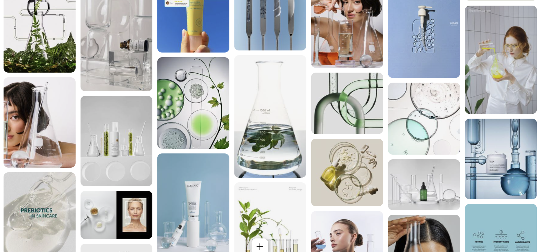
Concept
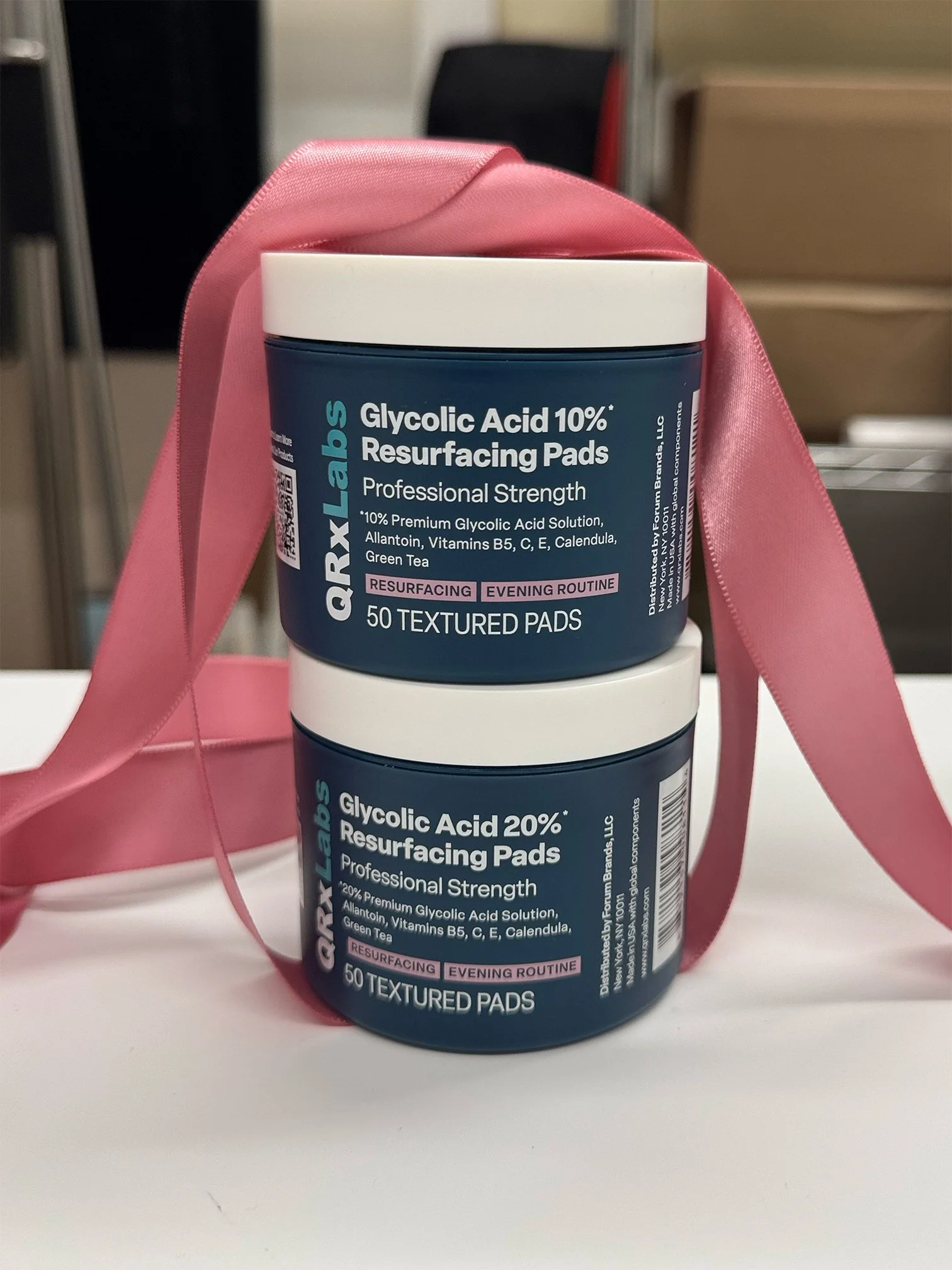
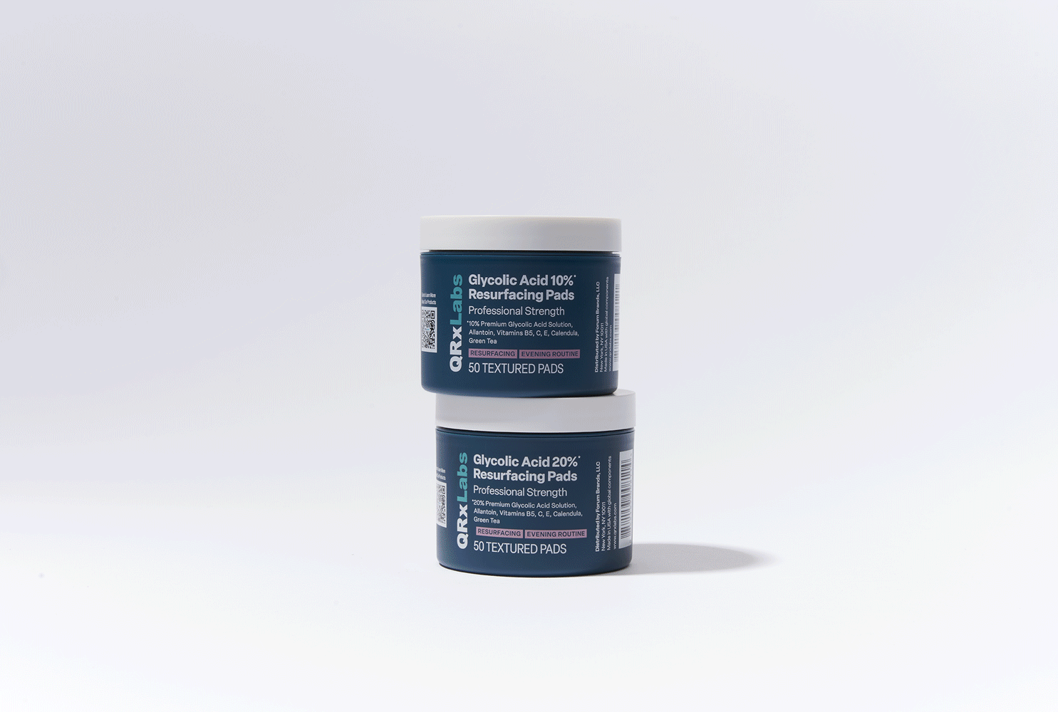
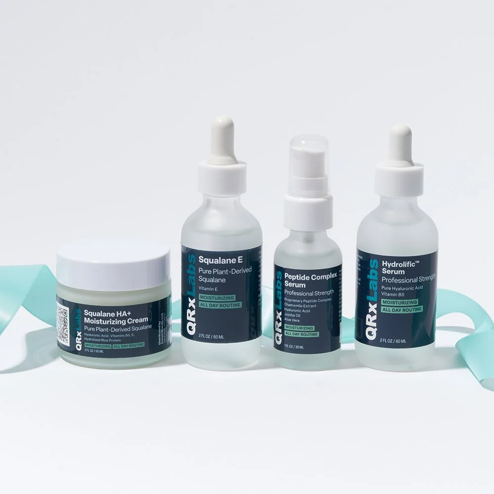
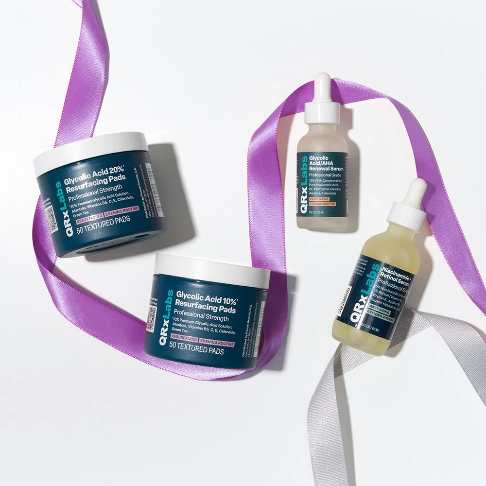
Developed the holiday campaign concept from moodboards to visual direction, creating a festive, gift-ready look in collaboration with brand managers. The aim was to introduce seasonal flair while keeping the presentation clean and elevated.

Production
Led the art direction during the in-house shoot, partnering with the photographer to bring the concept to life. Despite limited time, budget, and resources, the production delivered cohesive holiday visuals that felt playful, premium, and aligned with campaign goals.
Amazon
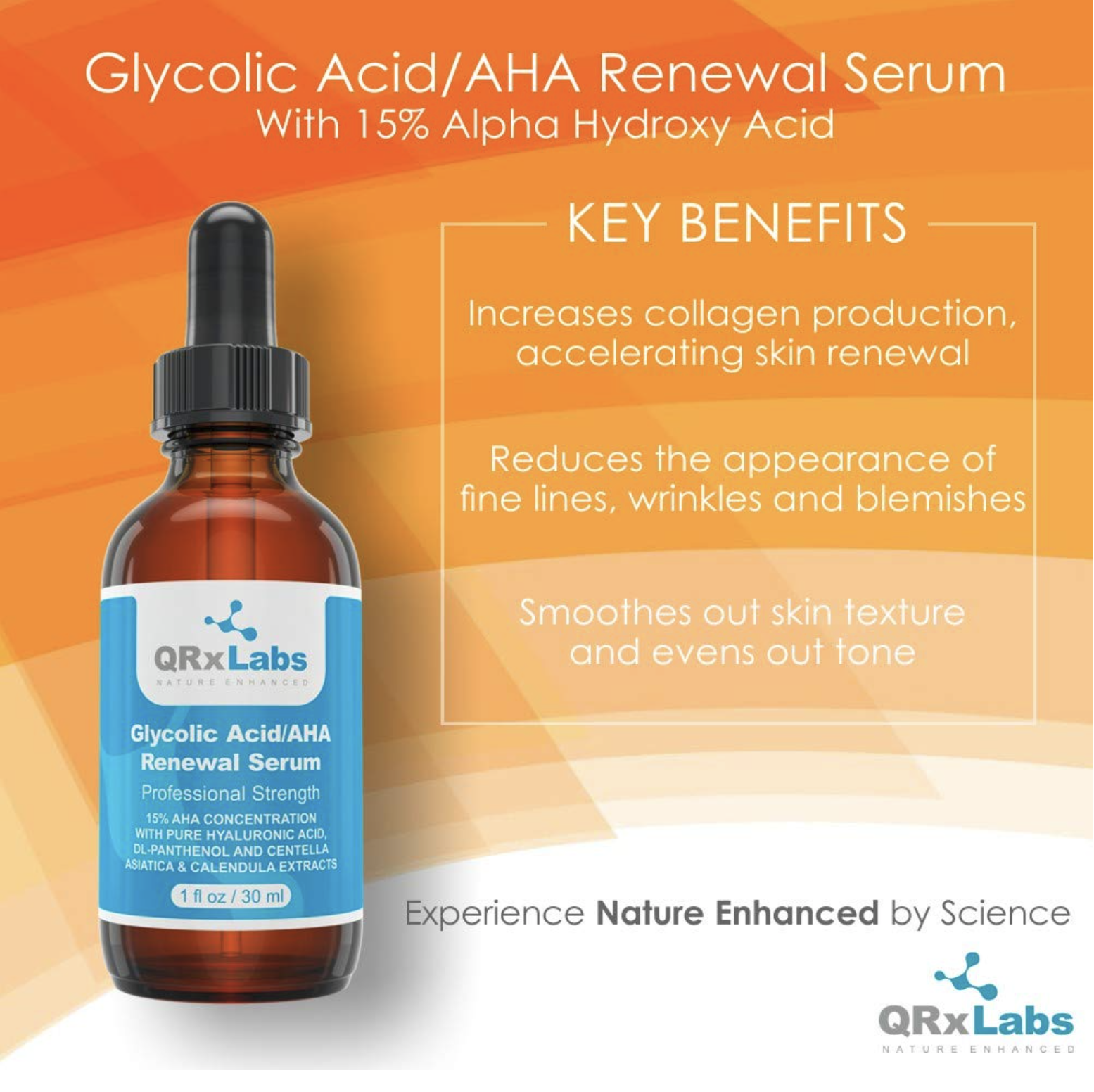
Before
The previous creative direction lacked visual cohesion, with inconsistent colors and heavy use of stock imagery. The unclear hierarchy between copy and visuals made it difficult for customers to quickly grasp key benefits or engage with the brand. As a result, the design felt outdated and failed to resonate with a defined target audience.

#003e51
#2392a1
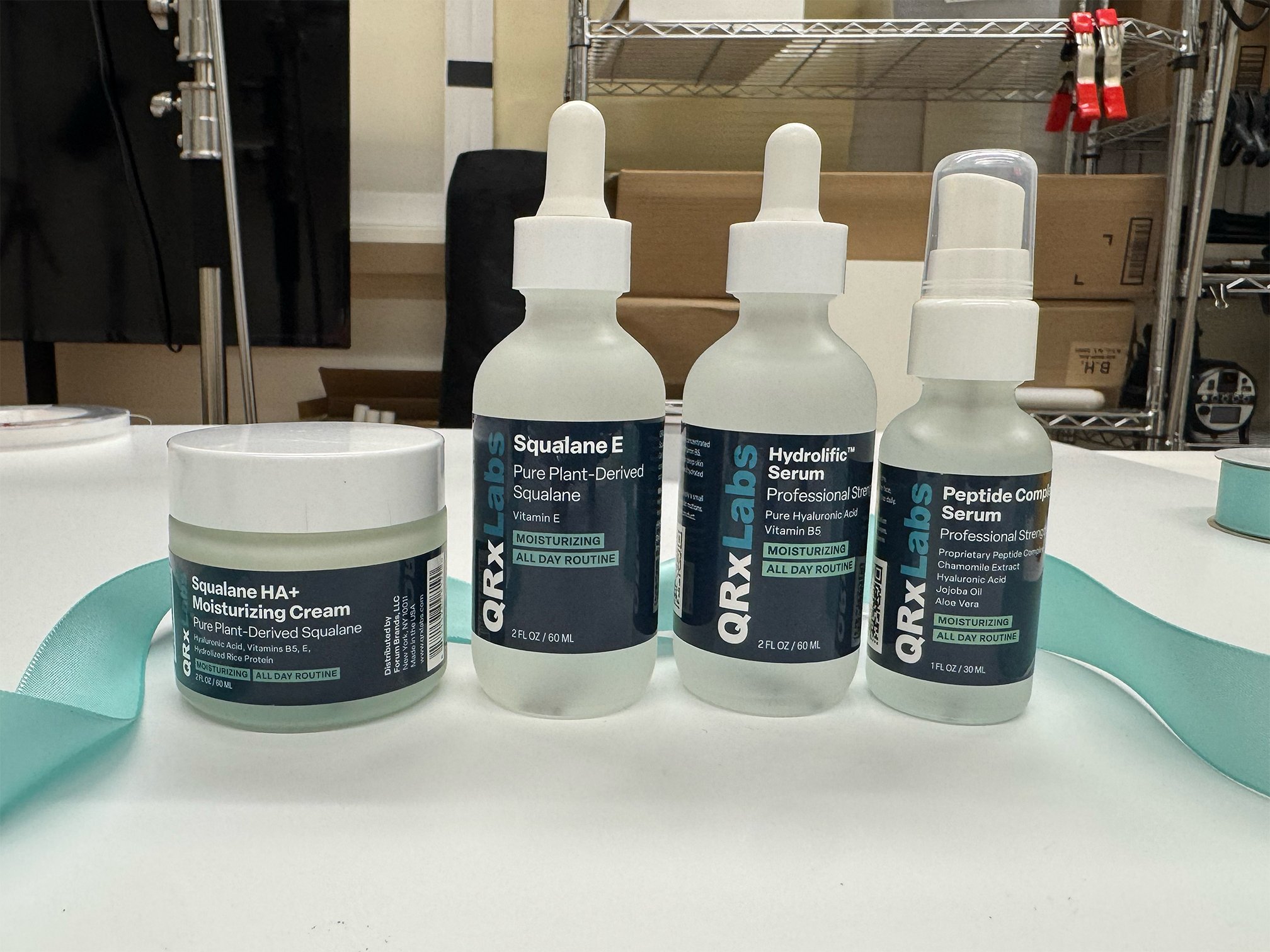
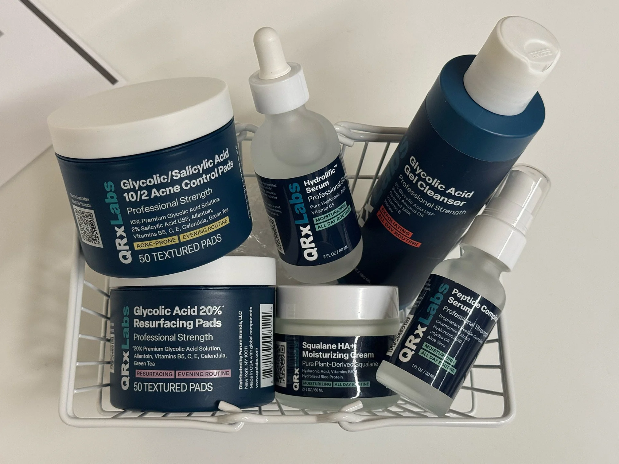
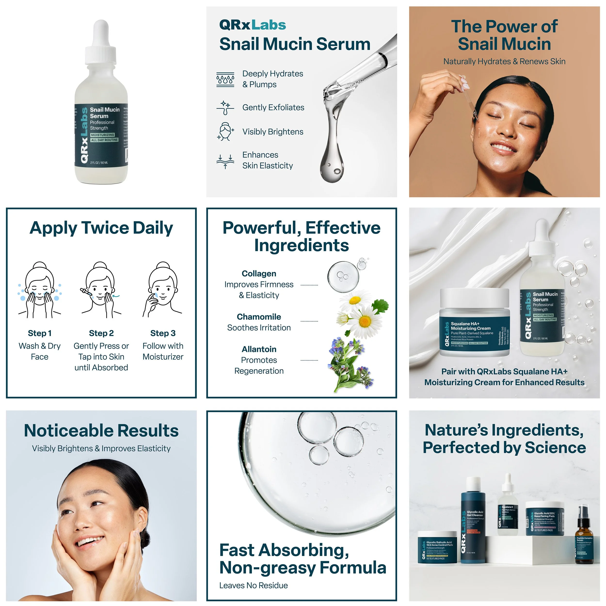
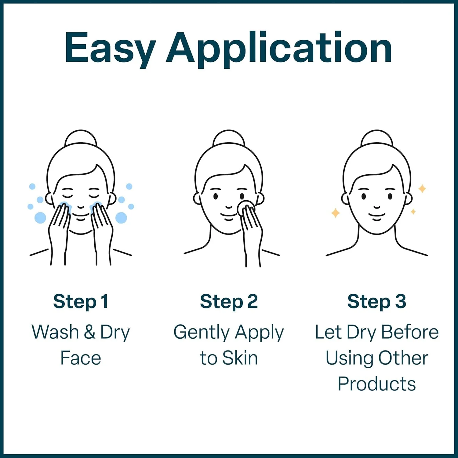
After
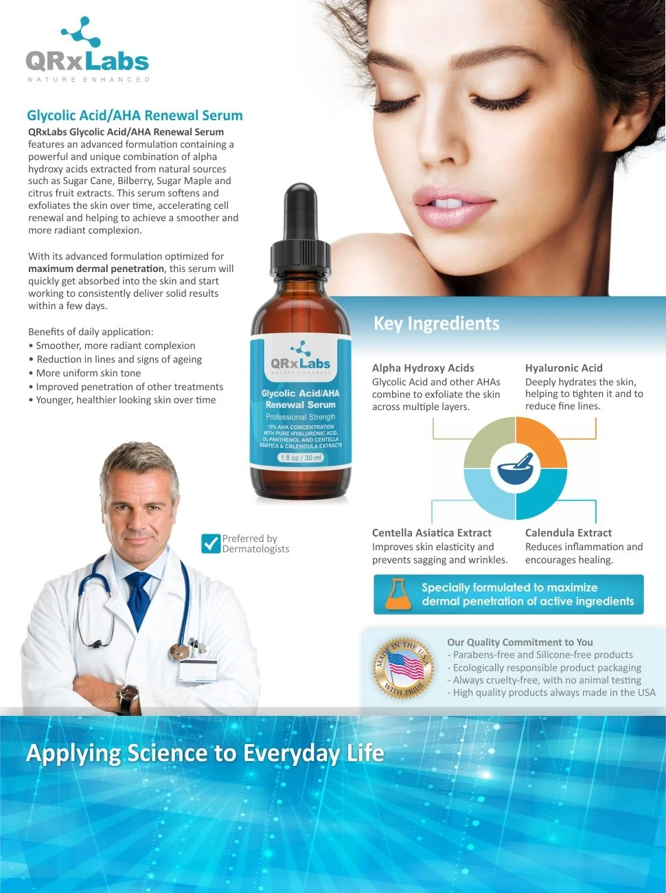
The redesigned assets establish a cohesive brand identity through a refined color system, clear visual hierarchy, and a stronger science-backed message. Information is now delivered through intuitive layouts and custom infographics, making product benefits easier to understand at a glance. The result is a modern, credible, and user-focused presentation that elevates the brand’s professionalism and clarity.
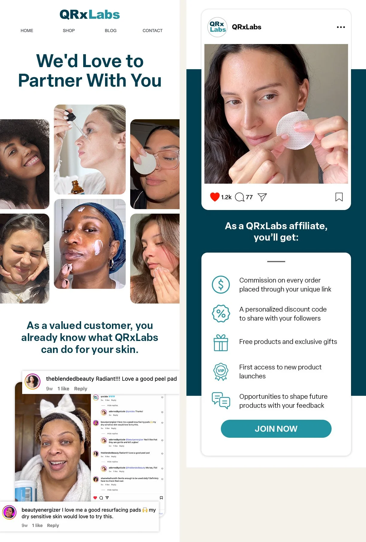
Social
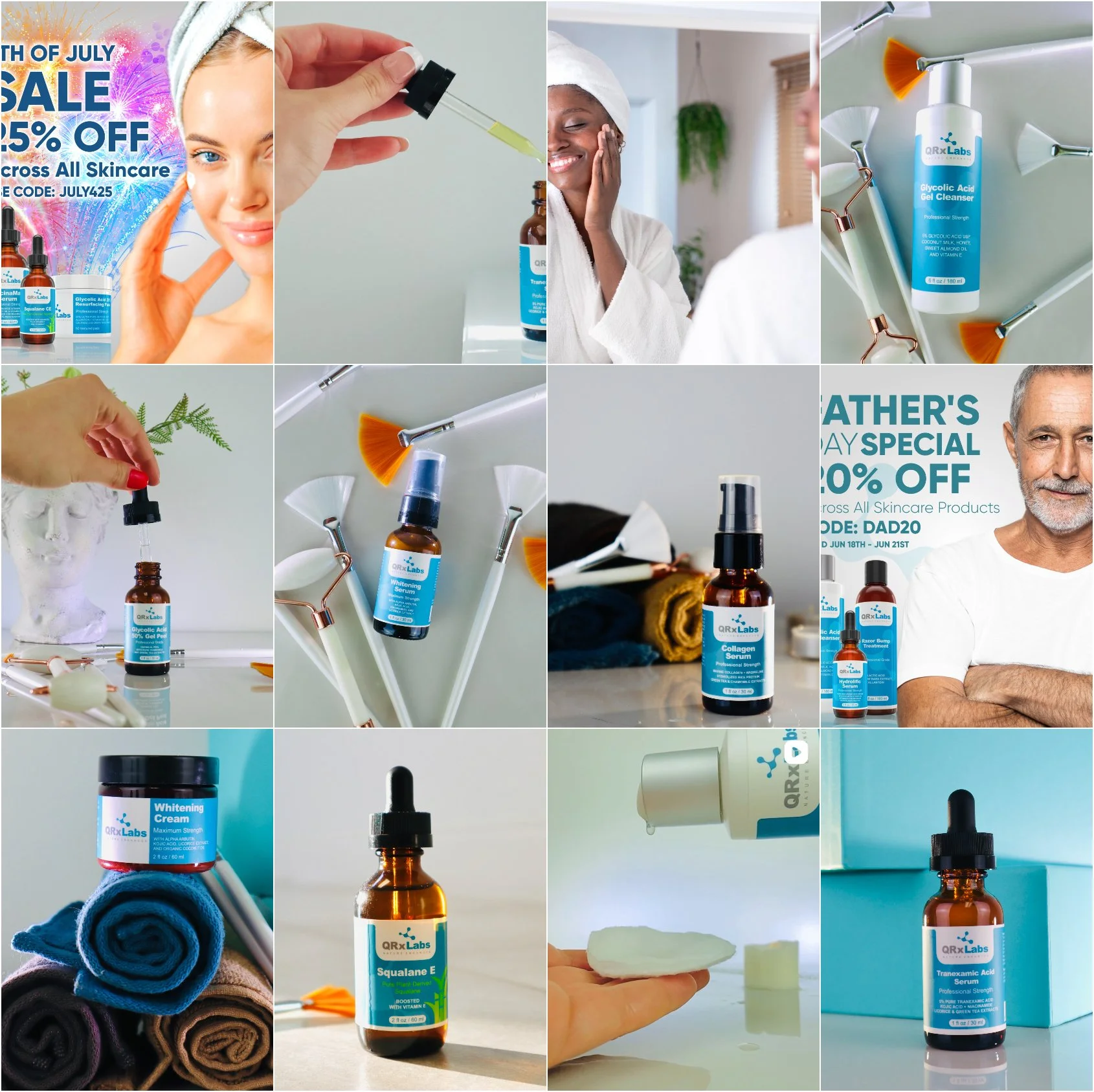
Before
The original social content leaned on stock-style images and inconsistent visuals, offering little clarity on who the brand was targeting. Without narrative or structure—mostly product shots and promotions—the feed lacked identity and failed to engage a specific audience.
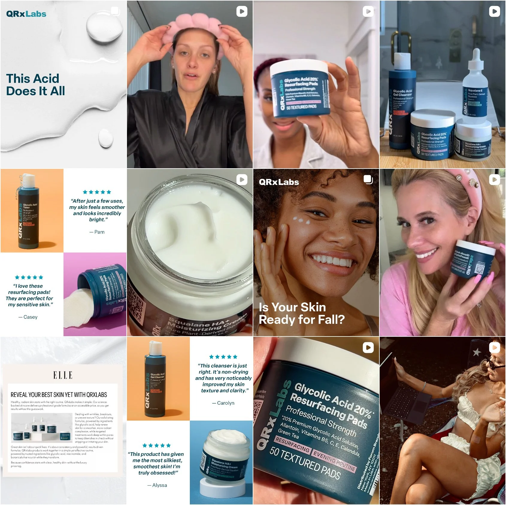
After
The new social direction expands beyond product-only posts, leveraging influencer UGC, affiliate content, educational storytelling, and branded entertainment to build credibility and drive engagement. A refined visual system and clearer targeting ensure the brand communicates with authenticity and relevance, resulting in a more dynamic and cohesive social presence.
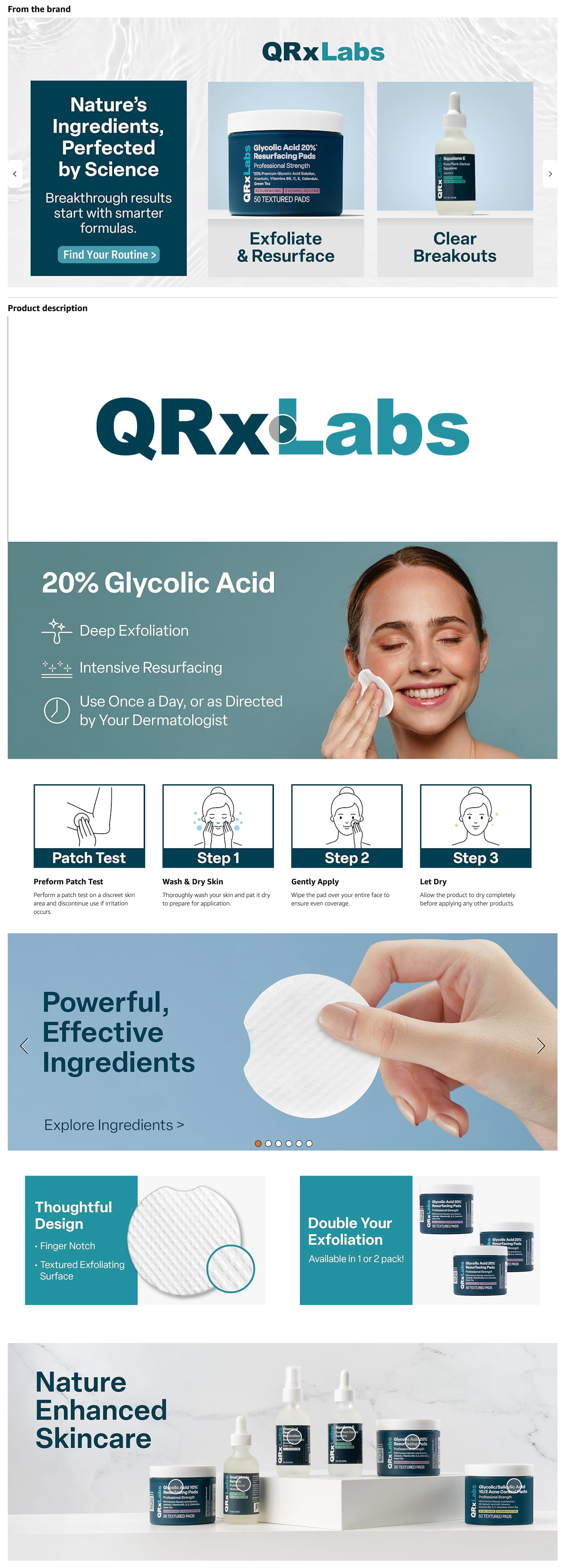
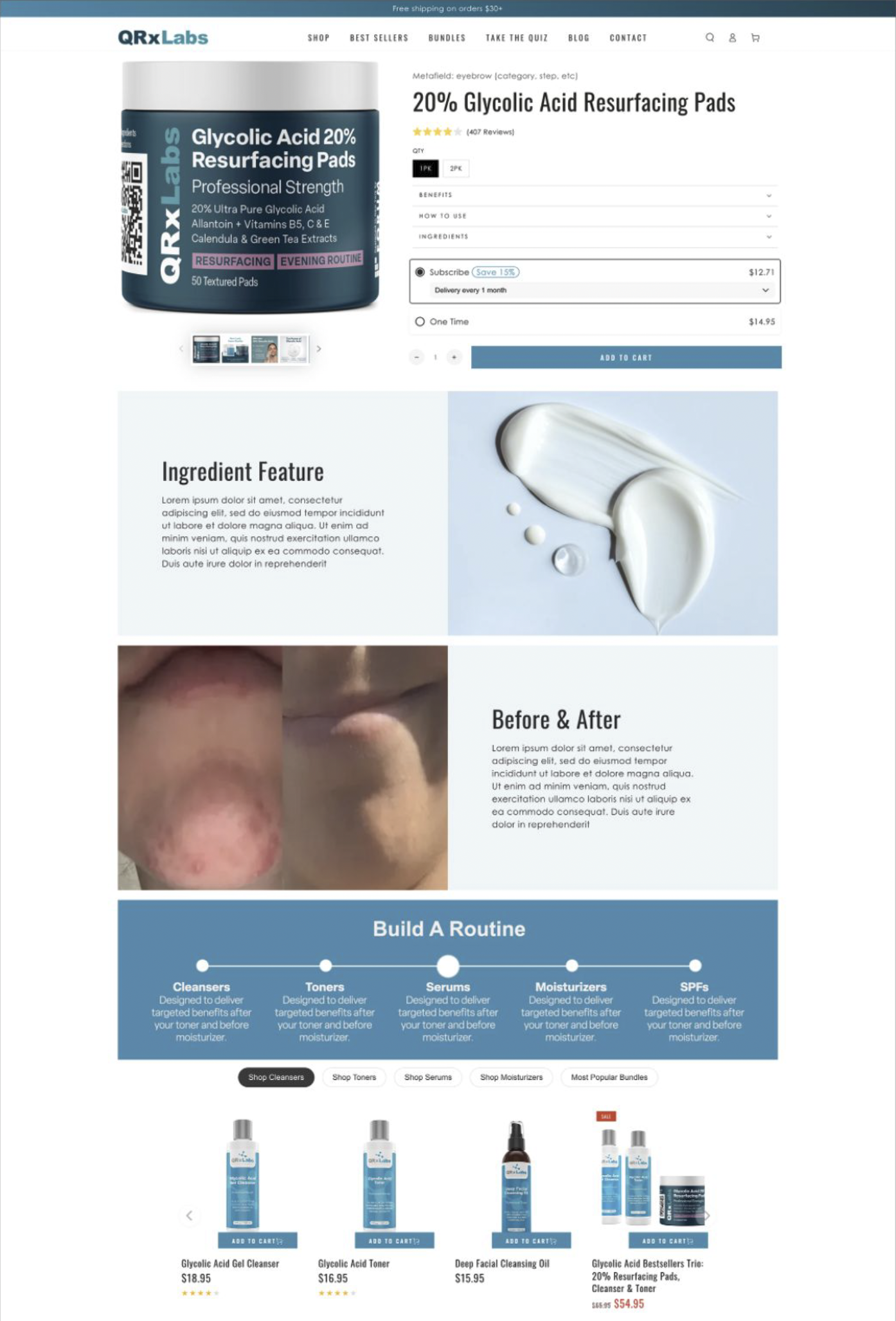
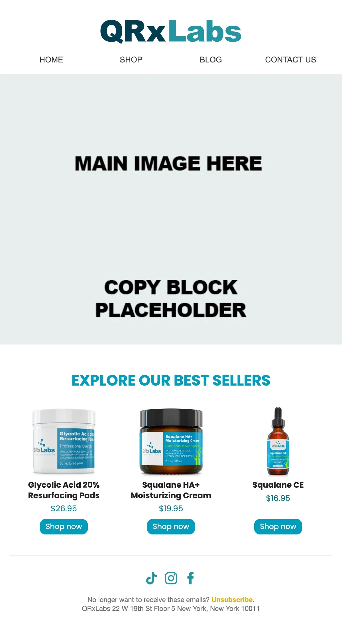
Website & Email
Before
Both the website and email relied on a simple structure with a hero image followed by copy blocks, offering little visual variety. Key ingredients were misrepresented with inaccurate imagery, and the routine section was overly copy-heavy, making information difficult to scan. Overall, the experience lacked clarity, cohesion, and engaging elements.
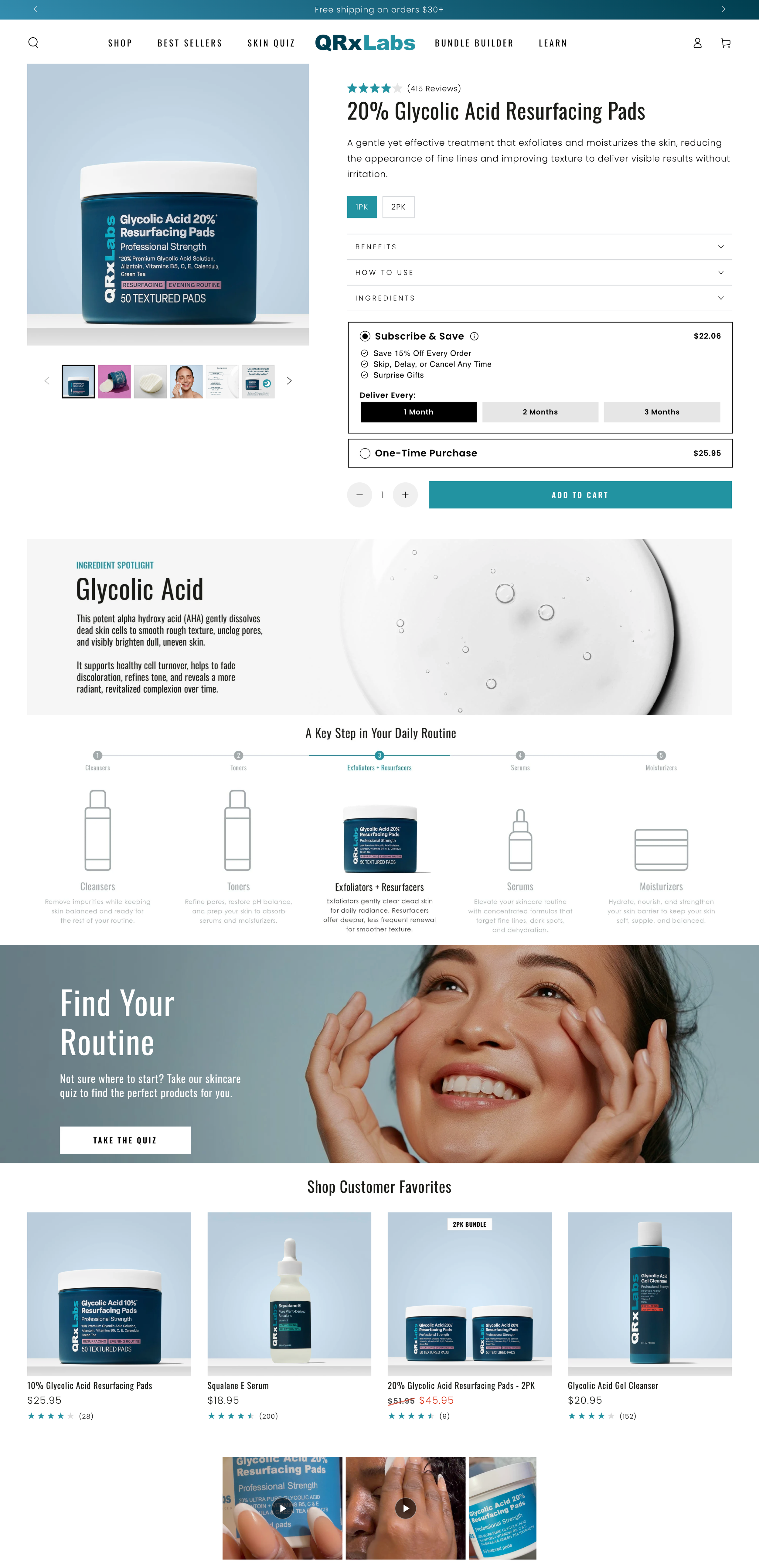
After
The redesigned website and email introduce accurate ingredient visuals, concise copy, and an intuitive infographic to replace the copy-heavy routine section. Social content and customer reviews were integrated to elevate engagement, while more dynamic layouts and varied design modules create a clearer, more modern, and compelling brand experience.
Impact & Performance Highlights